-
J2O approached VCCP to refresh its visual identity. Moving away from a dated, overly juvenile perception and repositioning the brand to better resonate with a Gen Z audience.
-
As lead designer, I established a clear creative direction: simplify the aesthetic, strip back unnecessary elements, and hero the product in a way the brand hadn’t explored before.
Central to this was the concept of a “rule of two,” inspired by J2O’s signature flavour pairings (such as apple & mango, or orange & passionfruit). This principle became a unifying thread across the entire design system.
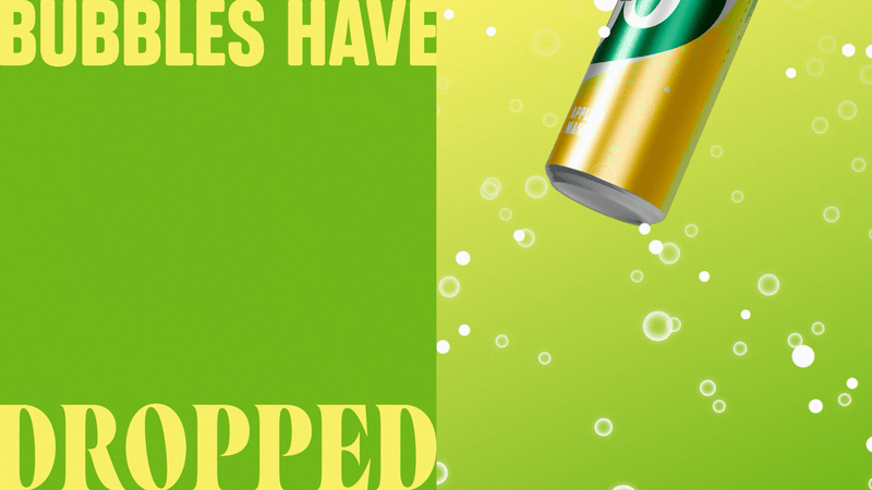
Working within a tight timeframe, I evolved the existing identity rather than rebuilding it entirely. I refined the colour palette by introducing two-tone gradients, reinforcing the “rule of two,” and paired a modern serif typeface with the existing sans serif to create a more distinctive and contemporary typographic voice, used together for headlines.
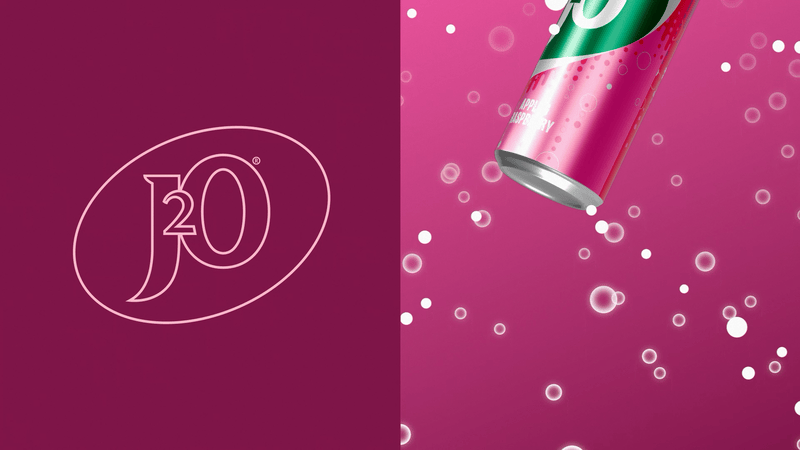
To build energy and visual balance, I developed a photography and 3D direction defined by sharp angles, high gloss, and a sense of movement. This was pushed further through details like liquid flowing over cans and bottles, amplifying the product’s sensory appeal and reinforcing its flavour-led identity.
To reinforce J2O’s iconic status, I also developed a standalone campaign centred on one of its most recognisable features: the bottle cap. The idea focused on capturing the tactile, satisfying moment of opening a J2O. The distinctive dented lid, designed to evoke craving and anticipation through a familiar, sensory experience.
-
J2O approached VCCP to refresh its visual identity. Moving away from a dated, overly juvenile perception and repositioning the brand to better resonate with a Gen Z audience.
-
As lead designer, I established a clear creative direction: simplify the aesthetic, strip back unnecessary elements, and hero the product in a way the brand hadn’t explored before.
Central to this was the concept of a “rule of two,” inspired by J2O’s signature flavour pairings (such as apple & mango, or orange & passionfruit). This principle became a unifying thread across the entire design system.
Working within a tight timeframe, I evolved the existing identity rather than rebuilding it entirely. I refined the colour palette by introducing two-tone gradients, reinforcing the “rule of two,” and paired a modern serif typeface with the existing sans serif to create a more distinctive and contemporary typographic voice, used together for headlines.
To build energy and visual balance, I developed a photography and 3D direction defined by sharp angles, high gloss, and a sense of movement. This was pushed further through details like liquid flowing over cans and bottles, amplifying the product’s sensory appeal and reinforcing its flavour-led identity.
To reinforce J2O’s iconic status, I also developed a standalone campaign centred on one of its most recognisable features: the bottle cap. The idea focused on capturing the tactile, satisfying moment of opening a J2O. The distinctive dented lid, designed to evoke craving and anticipation through a familiar, sensory experience.